For some time now, we are seeing the use of @font-face to load fonts which contain icons instead of letters. Although as much the advantages as the disadvantages of this use are quite arguable, the disadvantage which has called most my attention is to not be able to make icons with different colors, which is true only if you consider to make an icon from only one letter of the font. This way, I think we could consider to separate into different letters the icon shapes which had the same color and then put them together in the html in order to create a multicolor icon. This would also allow us to use the different elements to offer different versions of the same icon.

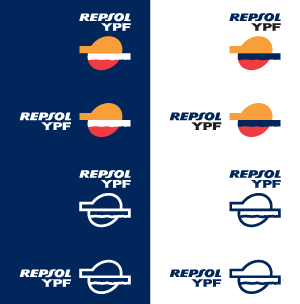
To do this test I have selected the Repsol logo as it has several colors and I have located a little Repsol corporate identity manual wich will serve for showing, on the basis of the different logo shapes, the different versions of it.
The first thing I have to define is the distribution of the elements on the different letters of the font:
- As I do not have the original Repsol Ypf font, I will insert these letters into the font I am going to create and, although I should place each of the letters of the logo name on its corresponding font letter, it will be easier to place REPSOL on one letter and YPF on a different one, as I am not going to use them in any other way.
- I will place each element of the logo icon on different letters of the font as they have different colors.
Now we have to get a font creator program. The first one which came to my mind is Fontographer. Those who had worked with Freehand when this belonged to Macromedia will remember that Fontographer used to come along with it in some version, and, although now it belongs to FontLab, it seems that it keeps on being a reference in its field. I do not know at all the details of this kind of font creator programs and neither it is one of my goals, so the comments about the most suitable program or tips for optimizing the creation of the font will be welcome.
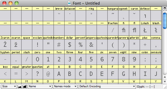
Once we have installed FontLab Studio or Fontographer, what we have to create is our new font, so File > New and we will be able to work on the map of our font.

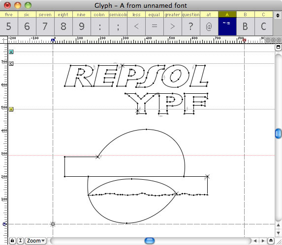
We place the logo on an Illustrator file and we export it to EPS. I have used the Illustrator 8 EPS version. We go back to FontLab, we double click on a letter, for example the A (capital letters), and the glyph window appears. We select from the menu File > Import > EPS… and we open the file exported to EPS from Illustrator, which will appear on the glyph window.

Now I am going to cut and paste each of the parts on the different letters of the font, A:REPSOL, B:YPF, C:shape 1, D:shape2, E:shape 3. This distribution will allow me to create any of the logo versions which came defined in the corporate identity manual. As I have mentioned before, I know nothing about creating fonts but you have to be careful with the direction of the outlines and the traces must be closed as otherwise we could obtain unwanted results. On my first test, although you could see correctly the created font on the print preview of Google Chrome, the holes of the R, P and O letters were shown as filled.
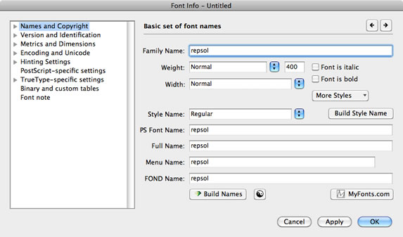
The next step is to define the font information. To do that, we select on the menu File > Font Info… and on the window which comes out we fill the different fields coming out and we press OK.

The font would be now ready to be created, so the only we would have to do is to select the menu File > Generate Font… and on the window which comes out, we give a name to it and then we select a format, True Type in my case.
We have got our truetype font which we can use on our computer, but we need to create a font which works with @font-face on the different browsers, so we will have to use @font-face Kit Generator from Font Squirrel, which at this point “It is an indispensible tool when implementing @font-face“. To do this test I have used the optimal configuration of @font-face Kit. Once the generated package is downloaded, we will be able to see the result of each of the glyphs on the html file which comes on the package.
Now it is time to create our logo on html and experiment with the different versions, so we create an html document in which we insert the css supplied by @font-face Kit and we create an element on the body to which we assign our font and on which we write the different letters we have used.
|
1 2 3 4 5 6 7 8 9 10 11 12 13 14 15 16 17 18 19 20 21 22 23 24 25 26 27 |
<!DOCTYPE HTML> <html> <head> <meta charset=“UTF-8”> <title>Logotipos Repsol con @font–face</title> <style type=“text/css”> @font–face { font–family: ‘repsolRegular’; src: url(‘https://poselab.com/files/en/blog/repsol-webfont.eot’); src: url(‘https://poselab.com/files/en/blog/https://poselab.com/files/en/blog/repsol-webfont.eot?#iefix’) format(’embedded-opentype’), url(‘https://poselab.com/files/en/blog/repsol-webfont.woff’) format(‘woff’), url(‘https://poselab.com/files/en/blog/repsol-webfont.ttf’) format(‘truetype’), url(‘https://poselab.com/files/en/blog/repsol-webfont.svg#repsolRegular’) format(‘svg’); font–weight: normal; font–style: normal; } .repsol{ font–family: ‘repsolRegular’; font–size:100px } </style> </head> <body> <div class=“repsol”>ABCDE</div> </body> </html> |
We can see that our page shows the different logo elements.
Now we are going to see how we assemble the logo, which is as simple as placing the different letters on different divs and applying the position:absolute style to them. In order not to insert each of the letters inside each div, we can use the selectors :before and ;after in combination with content. This allows us to modify the content from the css and we avoid inserting content without sense on our code. Here I am only going to use :after so you can see the example better, but using the two selectors we can save some tags on the html.
|
1 2 3 4 5 6 7 8 |
.repsol div{position:absolute; z–index:10} .repsol div.A:after{content: “A”; color:#00265C} .repsol div.B:after{content: “B”; color:#000000} .repsol div.C:after{content: “C”; color:#F89F39} .repsol div.D:after{content: “D”; color:#EE3C41} .repsol div.E:after{content: “E”; color:#00265C;} .repsol div.E{z–index:9} |
We use z-index to control the stacking order of the elements. In this case, I have placed behind the last element as this came bigger on its upper part on the identity manual and with that surplus covered by the other two elements. I also assign position:relative to this element so it marks the logo size. Finally, we assign the colors to each of the elements. The corresponding html would be the one you see below.
|
1 2 3 4 5 6 7 |
<div class=“repsol”> <div class=“A”></div> <div class=“B”></div> <div class=“C”></div> <div class=“D”></div> <div class=“E”></div> </div> |
Our logotype works on different sizes and we have assigned to it the rgb colors told by the corporate identity manual. To improve the display of the logo on the smallest sizes we can use -webkit-font-smoothing: antialiased.
Tags: @font-face CSS